People love graphs. There’s something about a little wavy line trending upwards that everyone likes. Cognos graphs have plenty of options, most of which are covered by the various courses and help files. These tricks aren’t always covered by the courses.
This won’t cover RAVE. I’m planning a big piece on RAVE later, so don’t worry. Instead, I’ll be using the graphs that come with Cognos 10. Most of these tricks will work with the legacy graphs however. Additionally, there are many books on how graphs should be constructed, why 2D is better than 3D, and why pies are best left as dessert items, so I won’t be talking about that either.
1. Adding more details to tooltips
The tooltips that Cognos generates are fairly simple. They show the label and values for the nodes and measure associated with that spot.
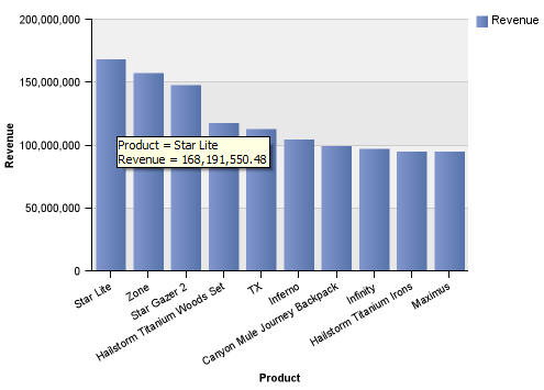
But what if you want to provide additional insights in the tooltip?
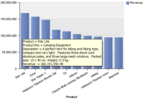
The first step is to force Cognos to include the extra details in the query. That can be done by clicking on the category node, in this case product, and selecting those fields in the properties. Next, set Custom Label to Show, and set the Source Type of the Chart Text Item node to Report Expression.
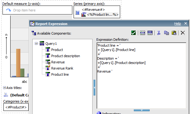
'Product line = '
+ [Query1].[Product line]
+'
Description = '
+[Query1].[Product description]
+'
Revenue '
The Custom Label item is normally used to change the word to the left of the = sign in the tooltip.
Notice this doesn’t change the appearance of the tooltip. The tooltips themselves are actually generated by the browser. All we’re doing is changing the title attribute in the area element on the page.
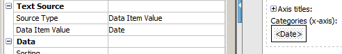
2. Data format on nodes
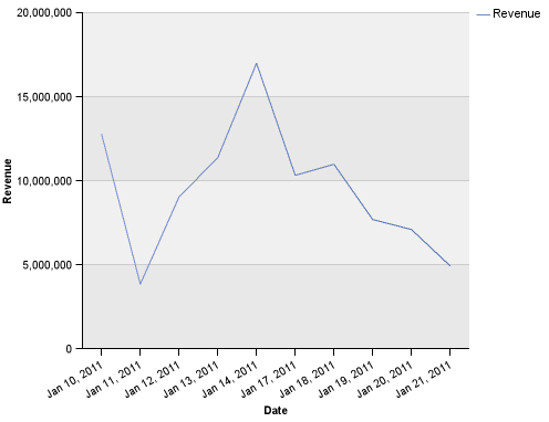
I get this question on a semi regular basis. Someone builds a graph with dates on the ordinal access. In a list the date is formatted correctly, but in the graph the date appears as an unformatted timestamp.
What’s happening is the node is automatically set to show the member caption. While using a dimensional source, like OLAP or DMR, that would make sense, but on a relational source it’s causing nothing but trouble. The member caption setting is instructing Cognos to use the value as the string, so it can’t be formatted. Fortunately it’s an easy fix, by setting the source type to Data Item Value, the default formatting defined in Framework can be used, or you can define on the field itself.
And the results:
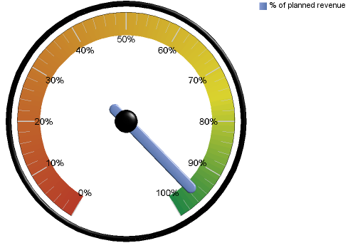
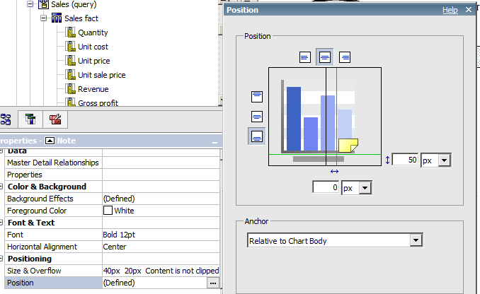
3. Values on a gauge
I’m not going to get into the discussion of the value of gauge graphs, nor will I preach and say there are plenty of better visual solutions, nor will I link to many various articles about why gauges are useless. Instead, I will admit to getting this request many times in misguided attempts to fix these horrible visualizations. The needle is rendered, but the user wants to see the exact value on the face of the dial.
No value:
With value:
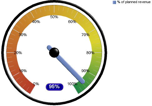
Setting it up is easy – create a note on the graph, set the text source type to data item value, on the measure itself. The position should be set to anchor Relative to Chart Body. The note can be styled as desired and you can make it as flashy as you want. You can use the same methodology on any graph type.
The next two items are graphs that I’ve been playing around with.
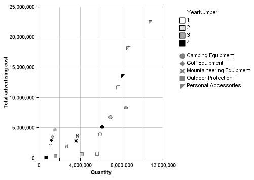
4. Trails in scatterplots
In one of Stephen Few’s newsletters, Stephen talks about using trails in scatterplots to view various attributes of change for a dot through time. Take a moment to read the article, the section on scatterplots starts on page 11.
It is almost possible to replicate the graphs using the standard Cognos scatterplot. By setting the color value over a running-count of the periods, and setting periods as the series, we can gradually increase the hue of the dot. By setting Product Line to the categories, the palette option “Change shape by category” can be used.
5. Many many lines
At first glance, this graph seems to be a mess of overlapping lines, completely useless for analysis.
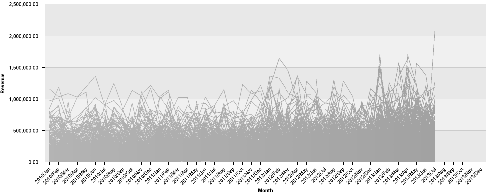
However, the purpose of the graph is to show the selected lines against everything else. We can see the shape of all of the sites per month, and when we select a few specific sites:
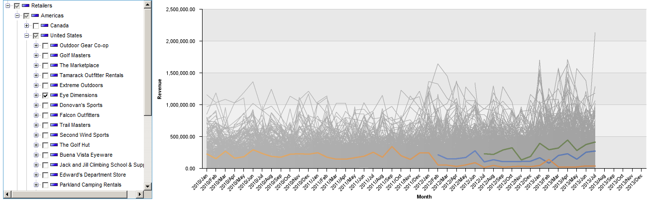
We can see how the Eye Dimension sites compare against each other and against all the other sites for each month. I would recommend placing a list or a crosstab immediately below the graph, so the user can see the actual details for the selected sites, and maybe the min/max/avg/med for the others. While this chart is showing trending over time, it can also be used to present other attributes (remembering of course to ignore the slope). Stephen Few has a nice article Multivariate Analysis Using Parallel Coordinates.
This example is different than the others in that I’m using a dimensional source. While it would be possible to build this graph over relational, it’s significantly easier with OLAP. The chart has two series on it. The first series has the palette set to gray, 1pt line. The expression is:
except(
[sales_and_marketing].[Retailers].[Retailers].[Retailer site]
,[Selected Retailers])
So that will show all of the lines for the unselected retailers.
The second series has a standard color palette, with each line set to 2pt. The Selected Retailers expression is:
#promptMany(
'Retailers'
,'mun'
,'emptySet([sales_and_marketing].[Retailers].[Retailers])'
,'descendants(set('
,''
,'),[sales_and_marketing].[Retailers].[Retailers].[Retailer site])'
)#
If nothing is selected, it will default to an empty set, allowing the first data item to show all data.
It’s worth pointing out that this type of chart can be a bit slow, especially if you’re pulling a lot of data. There are 820 sites in the Sales and Marketing cube and it takes 14 seconds to render the graph (admittedly on a mid-range laptop). The chart should also be set to disable all hotspots. 820 sites times 43 months makes 35,260 hotspots, that takes a lot longer to render.
Questions? Feel free to connect with us: info@performanceg2.com.